With kind permission from Blue to use his images I have carried on with some page layout graphics. The silly text is all on me (not Blue!), just using placeholder snippets to demonstrate the text feature. Before you go complaning to him these are not worthy names of Chaos Champions I mean
")
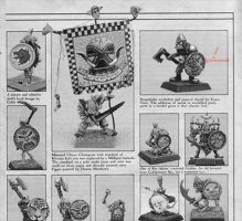
You'll find highres versions further down but here's a nice double page spread overview for ya.
Points of interest:
- The marbled background colour varies in 'Eavy Metal reference, probably both due to original print and successive scans. I have some versions in the master file, grey/green/red/yellowish varieties. What you see here is just one of them. A smaller set of these could be present in the master file for quick select variations. Those who are more adept at using digital imaging software out there could do more fine tuning from there.
- Font usage. There are various fonts in the reference through the years. We could try to emulate that and bulk out the master file but the question is, is it really worth the hassle. My recommendation would be to go for a minimal choice, making handling easy and giving pages a coherent style cross-creator.
- I have picked Caslon Antique which is one (but not the singular) choice for headlines often seen. I doubt many will disagree with this one being "the best" choice here. Opinions welcome of course.
- The image annotations are in Antique Type, something I picked rather ad hoc as a straightforward serif type. Suggestions welcome for other options, if you have any.
- Images. Most are simply a matter of dropping right in and a border gets added automatically. The exceptions are ones where bits stick out. This is more fiddly to achieve, but perfectly doable for people who understand the use of layers and masks and a bit of brush work.
- I added the original feature of earmarking each page "An OLDHAMMER Forum feature". I think this is nice to have so that the origins of digital images floating around are clear. I experimented with putting in the web address but opted out on it because it got a little bit fiddly and added unwanted complexity to the graphic design. Driving traffic is not the main purpose here and the Oldhammer Forum label should be enough info for people who want to google the source.
So there ya go. Not a final package yet but a good spot to gather some feedback. Logo looks great Zhu! And your minis are fantastic Blue, they made working on this so much fun.